Das Dorner Hotel, Identity, Digital, Publication, Product

DAS DORNER HOTEL
Since the renovation of the hotel and the takeover by the next generation, we support the Götsch family as lead agency in brand development. Amidst orchards and with a view of picturesque mountain ranges, we positioned Das Dorner as the place to feel good, enjoy and relax.
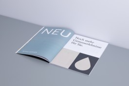
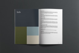
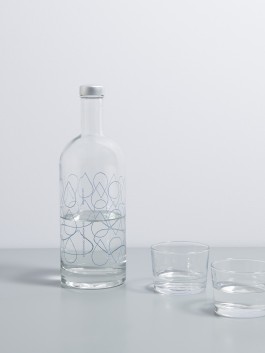
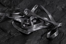
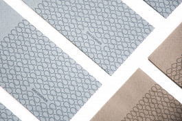
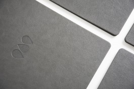
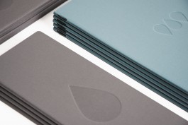
Perfectly coordinated with the hotel's modern architecture, the values of the hotel are also reflected in the brand and show up in color, form and material. We developed an intelligent and emotionally appealing communication strategy, with high design power - in the analog and digital space.
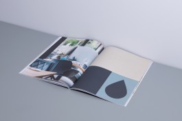
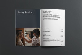
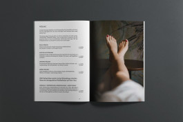
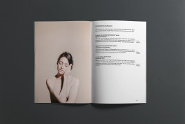
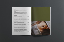
The colors used convey modernity and lightness. Warm natural tones in the spa area have a pleasant and calming effect.
The website is the digital flagship and often the first point of contact with the guest. For Das Dorner, we developed a user-friendly website and mobile application that communicates purposefully and leaves a lasting impression.
For this, we combined sound digital strategies with outstanding UX/UI design and storytelling.
Target formulation
→ timeless, chic, familiar, feel good, enjoy, relax

Services
Positioning Workshop
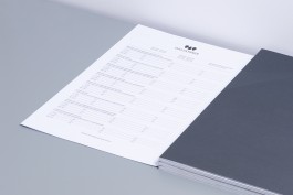
Design Manual
Naming & Claim
Webdesign, UI/UX Design
Communicationstrategy
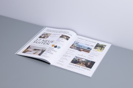
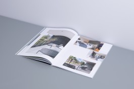
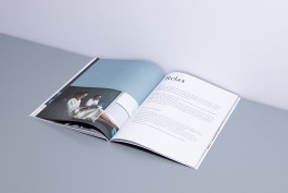
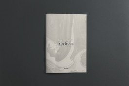
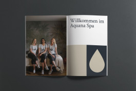
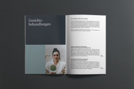
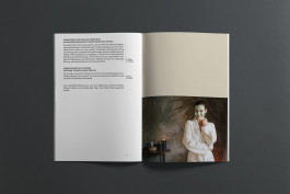
Imagebroschure
Corporate Identity
Print advertisement
Logo
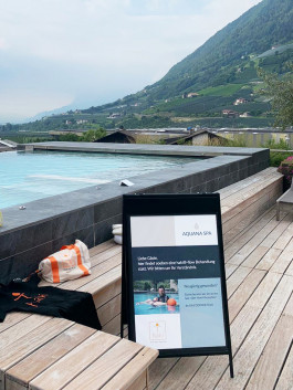
Guidance system
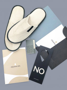
Hotel equipment
Webdevelopment

Client: Das Dorner
Creative Direction: FRENDZ.CLUB
Webdevelopment: Matthias Planitzer
Das Dorner Hotel, Identity, Digital, Publication, Product


DAS DORNER HOTEL
Since the renovation of the hotel and the takeover by the next generation, we support the Götsch family as lead agency in brand development. Amidst orchards and with a view of picturesque mountain ranges, we positioned Das Dorner as the place to feel good, enjoy and relax.
Perfectly coordinated with the hotel's modern architecture, the values of the hotel are also reflected in the brand and show up in color, form and material. We developed an intelligent and emotionally appealing communication strategy, with high design power - in the analog and digital space.
The colors used convey modernity and lightness. Warm natural tones in the spa area have a pleasant and calming effect.
The website is the digital flagship and often the first point of contact with the guest. For Das Dorner, we developed a user-friendly website and mobile application that communicates purposefully and leaves a lasting impression.
For this, we combined sound digital strategies with outstanding UX/UI design and storytelling.
Target formulation
→ timeless, chic, familiar, feel good, enjoy, relax


Services
Positioning Workshop
Naming & Claim
Communication strategy
Corporate Identity
Logo
Hotel equipment
Design Manual
Webdesign, UI/UX Design
Imagebroschure
Print advertisement
Guidance system
Webdevelopment


Client: Das Dorner
Creative Direction: FRENDZ.CLUB
Webdevelopment: Matthias Planitzer