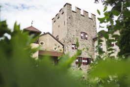
Goals:
unique
authentic
future-oriented
traditional
The desire of the population for a uniform appearance of the village of Latsch in South Tyrol was one of the concerns mentioned in the survey for the creation of the mission statement "Living Space Laces". In addition to clarifying and finalising the characteristics of the municipality's emblem, a new image has now also been designed to present the municipality in a uniform way.
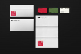
It is a new brand that gives the municipality its own distinctive identity and with which the municipality presents itself uniformly both internally and externally. The new image is to be used in correspondence and communication with the population, with offices and authorities, as well as for events, advertising measures and local marketing.
Expertise
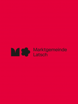
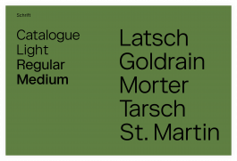
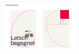
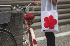
The five leaves stand for the main village of Latsch and the four fractions Goldrain, Morter, Tarsch and St. Martin im Kofel.
The municipality administration was keen to have a brand designed that would be traditional and familiar on the one hand, but also modern on the other.
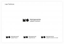
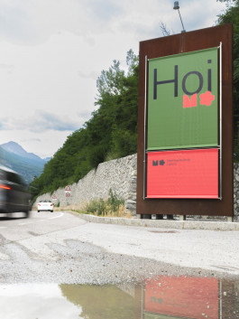
The unity symbol is based on the roses of the emblem. For the "market community", the letter "M" was taken out of the symbol of unity, the character is reminiscent of battlements of a castle. The result is a figurative mark consisting of the two symbols.
Brand elements
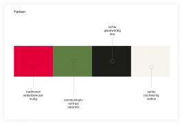
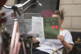
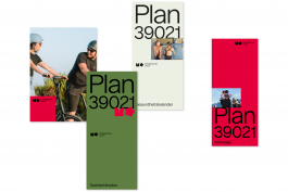
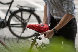
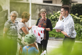
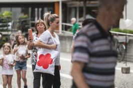
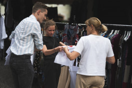
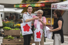
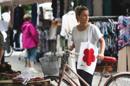
With small actions, such as the distribution of merchandise, the brand is brought into the homes of the citizens.


Photos: Manuel Pazeller

The desire of the population for a uniform appearance of the village of Latsch in South Tyrol was one of the concerns mentioned in the survey for the creation of the mission statement "Living Space Laces". In addition to clarifying and finalising the characteristics of the municipality's emblem, a new image has now also been designed to present the municipality in a uniform way.
It is a new brand that gives the municipality its own distinctive identity and with which the municipality presents itself uniformly both internally and externally. The new image is to be used in correspondence and communication with the population, with offices and authorities, as well as for events, advertising measures and local marketing.
Goals:
unique, authentic, future-oriented, traditional
Expertise
The five leaves stand for the main village of Latsch and the four fractions Goldrain, Morter, Tarsch and St. Martin im Kofel.

The municipality administration was keen to have a brand designed that would be traditional and familiar on the one hand, but also modern on the other.
The unity symbol is based on the roses of the emblem. For the "market community", the letter "M" was taken out of the symbol of unity, the character is reminiscent of battlements of a castle. The result is a figurative mark consisting of the two symbols.
Brand elements


With small actions, such as the distribution of merchandise, the brand is brought into the homes of the citizens.


Photos: Manuel Pazeller